
Case studies
A zero-to-one product launch, Messenger Communities, I helped shape from the ground up for Messenger @ Meta, now supporting over 2M daily active users worldwide with 10% week-over-week growth. These case studies explore how we got there: from establishing trust in a new product category, to solving the cold start problem that threatened early retention, to architecting the naming system that unified it all across Instagram and Messenger.
Paradigm shift
Background & challenges
Historically, Messenger has been synonymous with private communication between friends and family, a mental model reinforced by the rollout of end-to-end encryption (E2EE) in 2023–24. Messenger Communities introduced a fundamentally different use case: semi-public, interest-based groups that anyone could discover and join. This wasn't a feature update. It was a paradigm shift that required users to rethink what Messenger is for.As a company-level priority and a zero-to-one product launch, the stakes were high — and I was the sole content designer on the team. Working across Product, Design, Research, and Legal, I needed to shape both the product identity and the user experience from the ground up.To support adoption, we needed to:
Position community discoverability as a benefit, not a risk
Empower admins with tools to manage community membership and access
Build trust by clearly communicating what communities are and how they work
Solutions & impact
Product positioning and value props
The initial value propositions were PM-drafted and growth-oriented: functional internally, but not built around how a real user would evaluate a new product. I reframed them around the user-centered needs, concerns, and motivations that research had surfaced: the desire to build communities without the overhead of a Facebook group, the appeal of scale (up to 5,000 members), and the need to feel in control of who participates.The result was three A/B tested value propositions that reframed communities as approachable, useful, and safe, thereby shifting perception of Messenger from a private messaging app toward something more open and social.IMPACT
~23% lift in new community creation within 6 weeks of the NUX launch.

Creation flow: value prop carousel
Trust and safety
Collaborating with Product and Legal, I helped shape both the "Request to Join" feature concept and its content experience, giving admins meaningful control over membership while clearly communicating the public nature of communities to new members. This included negotiating the right balance between discoverability and safety, and partnering with Legal to translate community visibility and moderation requirements into plain, reassuring language for an info sheet.IMPACT
~14% increase in new community creation the month following launch; ~39% of new communities opted into the request-to-join model. The majority of surveyed users reported improved clarity: "This makes sense. It makes sense you can search for the things you're interested in."
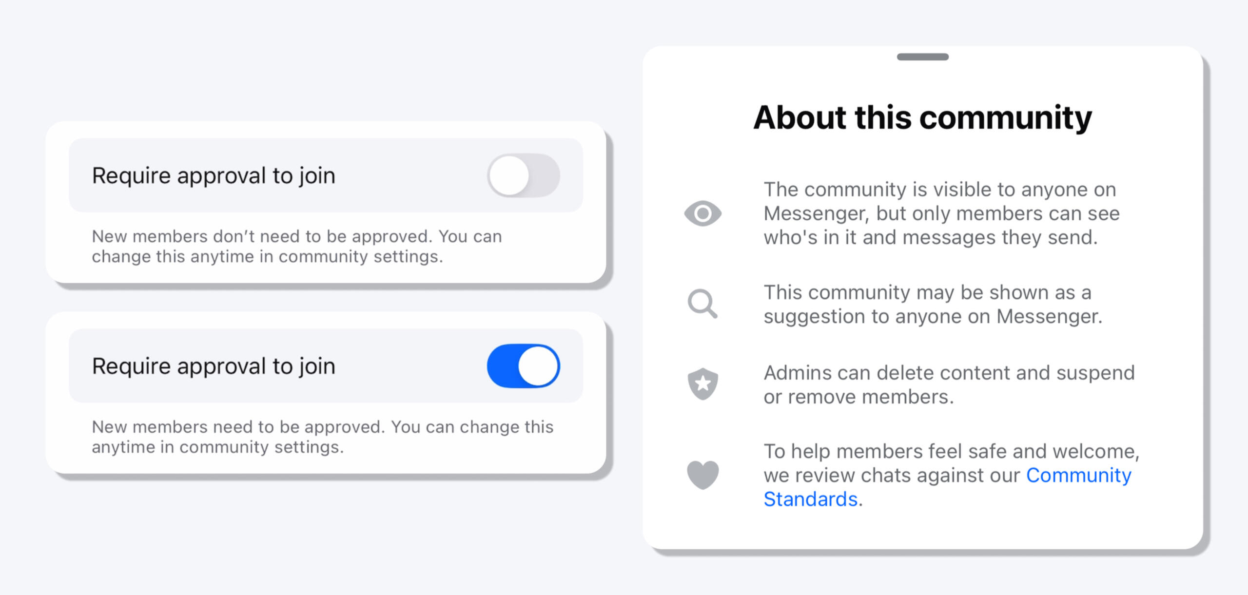
Approval to join toggle | Info sheet

Cold start & activation
Background & challenges
While community creation was growing steadily, many newly formed groups quickly stagnated. Message sends per user remained flat, and a significant number of users disengaged within two weeks of joining.The culprit was a classic cold start problem, on both sides of the community. Admins, having been guided through the creation flow, arrived at a blank community with no idea how to get people actually talking. Members, receiving an invite and joining, faced an empty space with no social cues to orient them: "Okay, I joined a community… what does that mean?"To understand the problem, we ran a targeted UXR study: participants created and joined communities for a month, then came in for in-person interviews and real-time iterative prototype testing. As the sole content designer, I helped shape both the research synthesis and the solutions we tested.To solve for this, we asked:
How might we equip admins with lightweight tools to spark engagement from day one?
How might we reduce social friction for new members and create a welcoming, low-risk environment for that first interaction?
Dynamic invite banner
Solutions & impact
SOLVING ADMIN COLD START: GROWTH
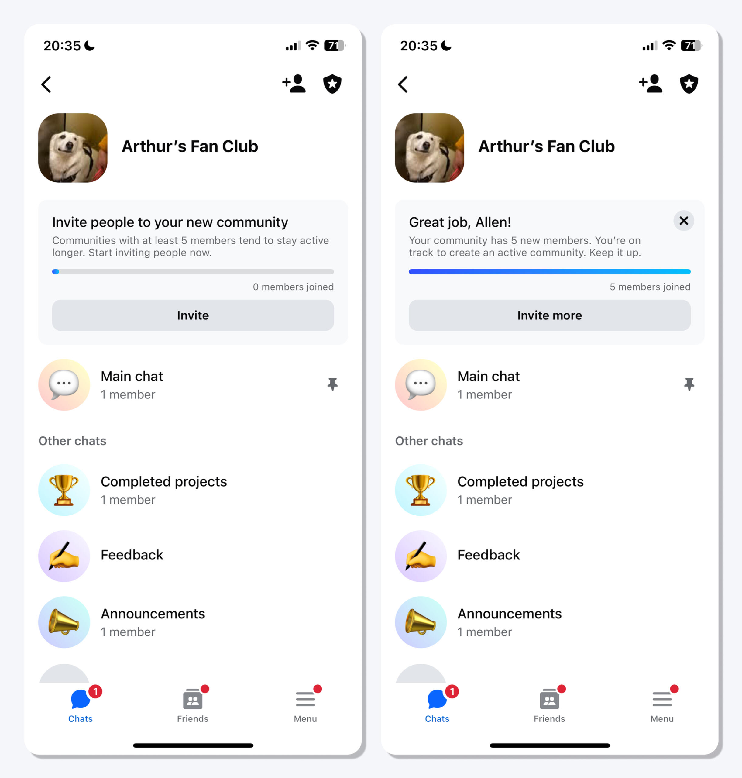
To address the blank-slate problem admins faced after creation, I designed an invite banner with dynamic content and a progress bar, surfacing data that showed a direct correlation between early member count and community longevity. Rather than just prompting admins to invite people, the banner gave them a concrete, motivating reason to act.IMPACT
Average member count increased from 2.7 to 5.3, and early data suggested this contributed to reversing the Week 2 drop-off; active participation stabilized at ~28%.
Welcome banner
SOLVING ADMIN COLD START: ONBOARDING
I designed a customizable welcome banner that gave admins a lightweight but high-visibility tool to greet members and set the tone for their community from day one.IMPACT
Communities with the welcome banner saw per-user message sends rise from ~1.9 to ~5.1 in the first week after creation. The component was organically adopted by other Messenger teams for use cases across the app and eventually integrated into the Messenger design system.
Welcome banner | Chat hierarchy | Chat snippets
SOLVING MEMBER COLD START
Working collaboratively with the product and design team, I helped shape three interconnected solutions to reduce the friction new members felt when entering an unfamiliar space:
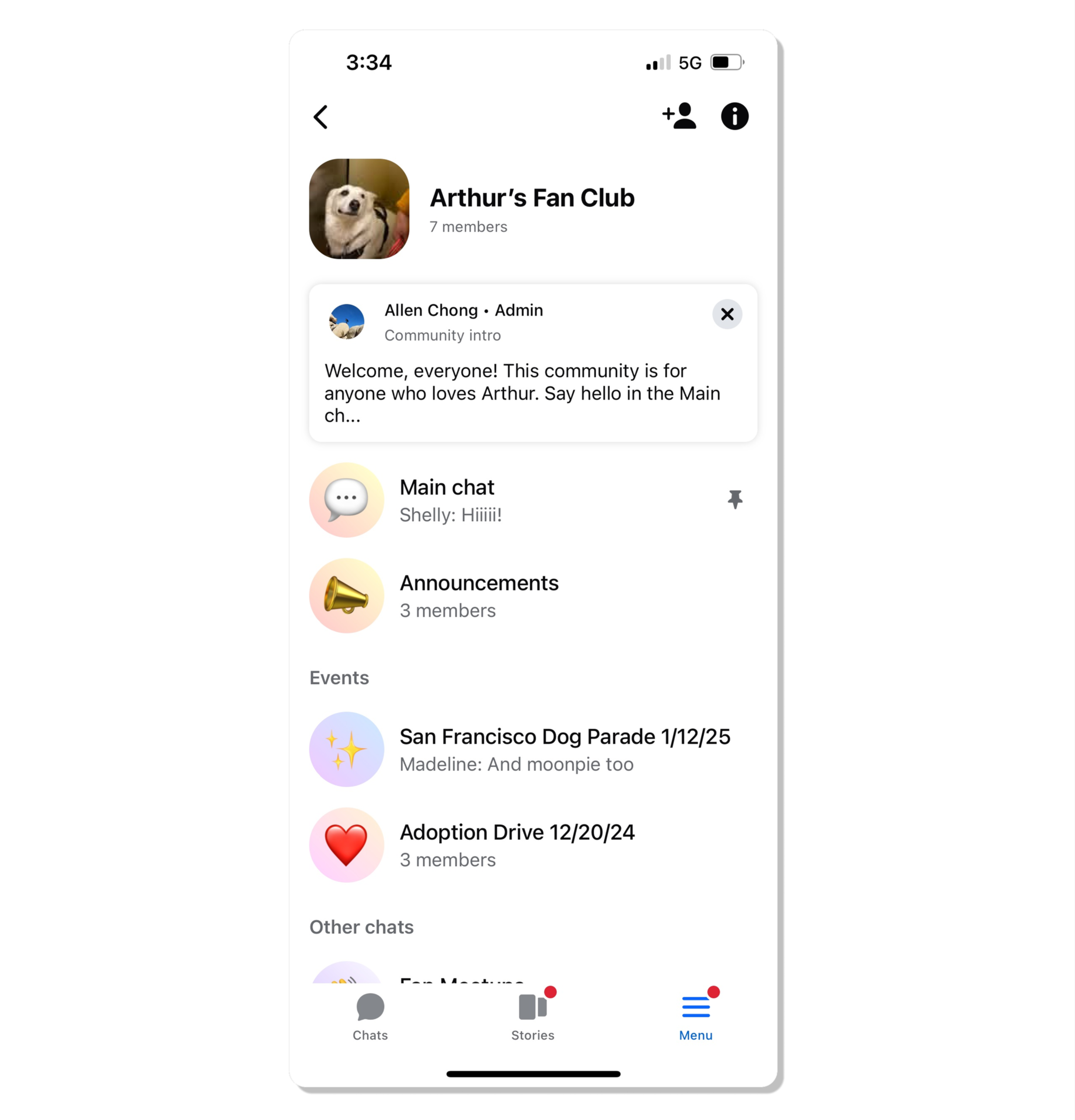
Welcome banner visibility: Made the admin-authored welcome banner visible to all members on entry, providing an immediate, friendly orientation point.
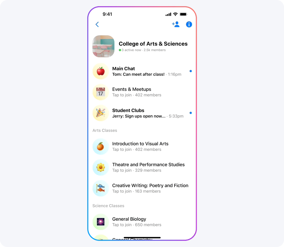
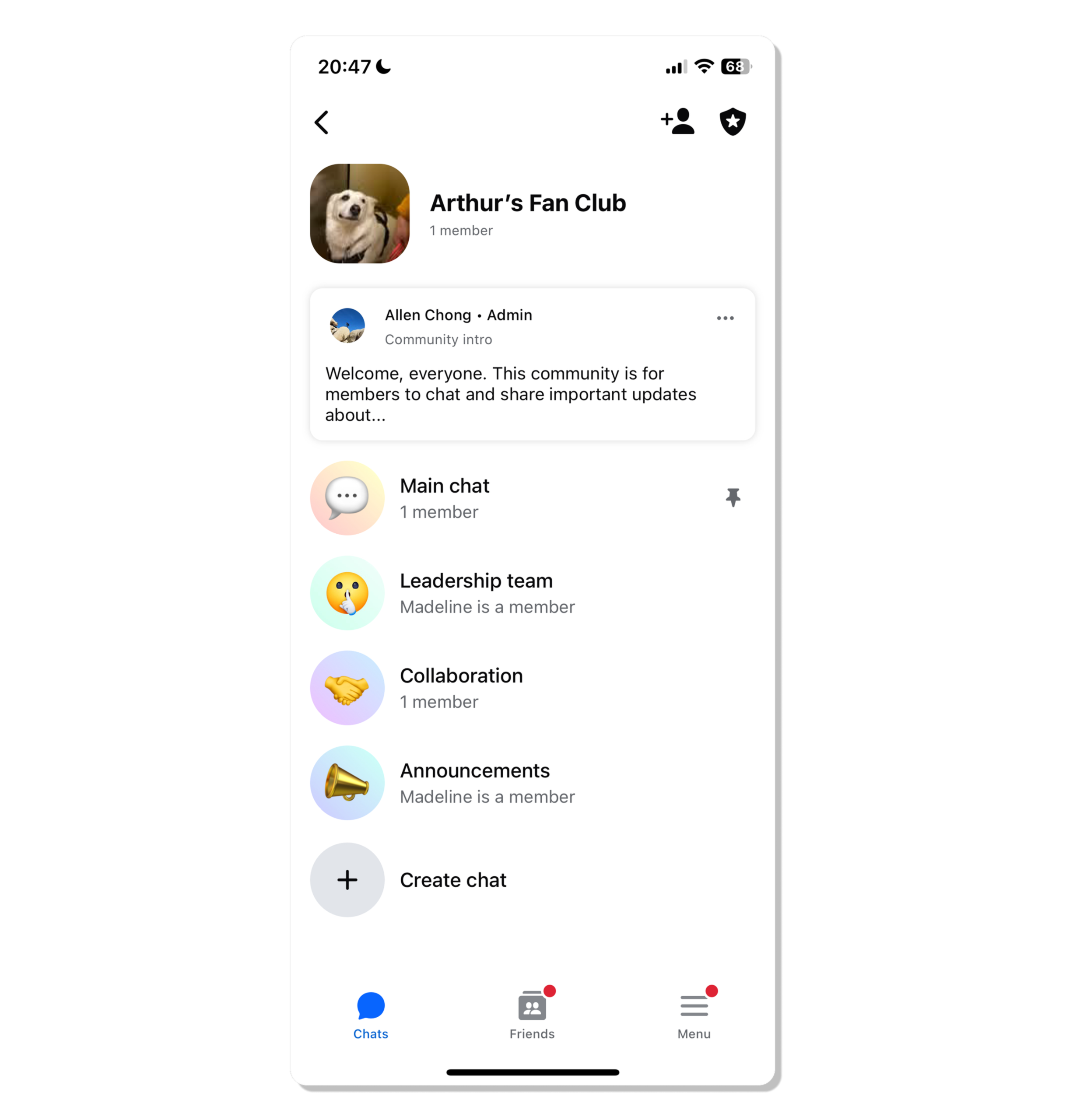
Chat hierarchy: Introduced a pinned Main chat and customizable chat sections to reduce ambiguity and give members a clear place to start.
Chat snippets: Added text previews and participant info to each chat, giving members social proof to assess activity and feel confident enough to participate.
User feedback validated the approach: "If this wasn't here, I wouldn't know what we're supposed to do." "I would start by checking the Main chat because that's where the most people are." "If I know one of my friends is in the chat, that would make me want to join more."
Unified naming architecture
Background & challenges
Across Instagram and Messenger, the same feature had two different names. A space where anyone could join and message over shared interests was a "social channel" on IG and a "community chat" on Messenger: naming debt inherited from independent teams building in parallel.The terminology had accumulated over two years. "Broadcast channel" was introduced to distinguish one-way from two-way communication, but UXR revealed it localized poorly, tested unfavorably with younger audiences who associated it with old radio technology, and caused internal confusion around live video.Guardrails: Any solution had to work across both apps, differentiate public community spaces from private chats, and flex to accommodate new verticals without requiring future renames.To align the ecosystem, we asked:
How might we reconcile fragmented product identities to ensure that functionally identical primitives share a cohesive cross-app identity?
How might we modernize the global lexicon to replace legacy modifiers that localized poorly and caused internal technical confusion?
How might we establish a scalable naming framework that allows Meta to expand into new community verticals without constantly inventing non-standardized prestige names?
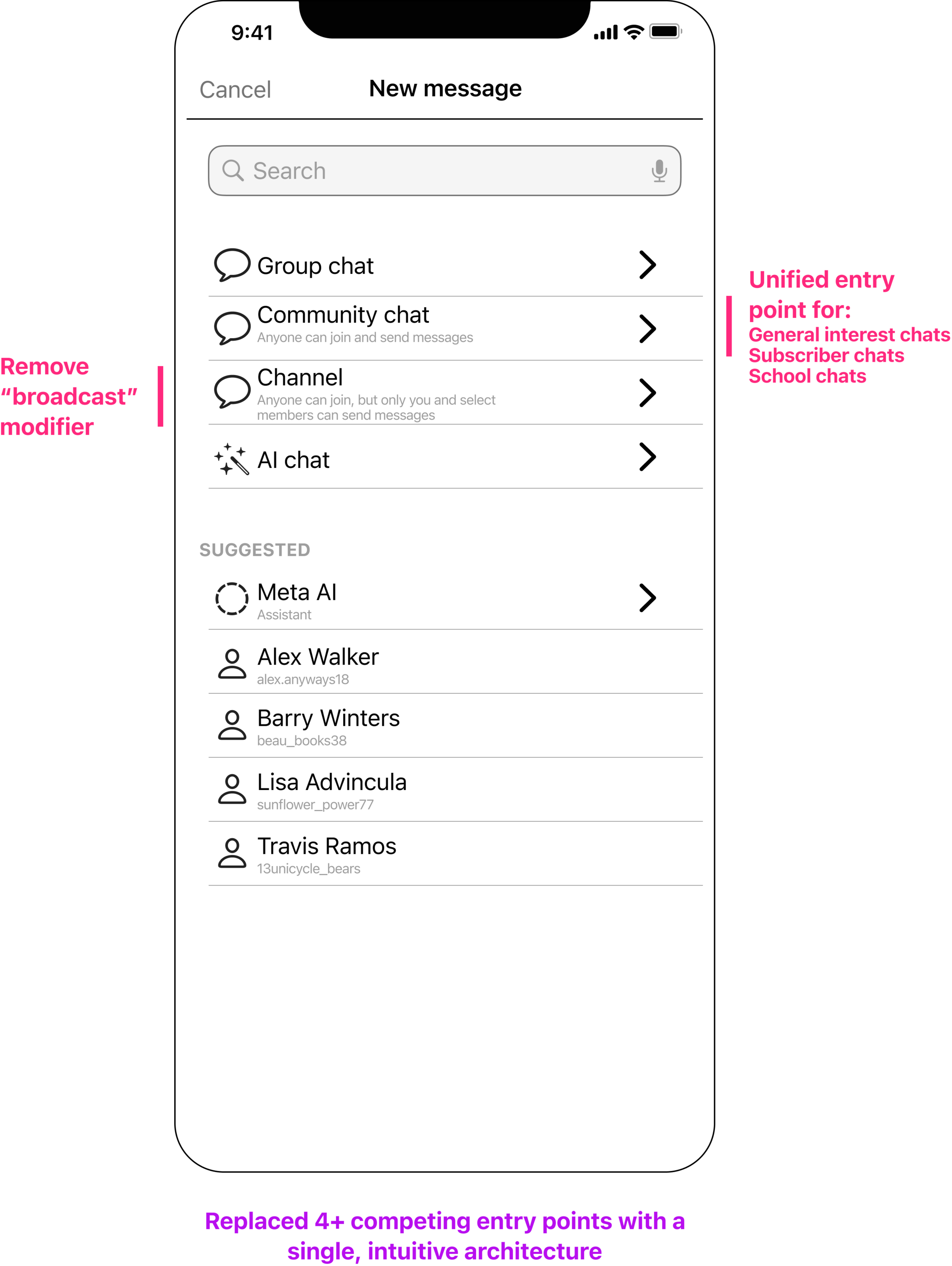
Annotated wireframe demonstrating the new, scalable naming architecture for community messaging
Solutions & impact
Architected a scalable information hierarchy
Architected "community" as a meta-primitive: Led cross-functional efforts to expand the definition of "community" beyond a UI container into a shared audience identity: a membership anyone could join around shared interests. This allowed social connections to scale across diverse messaging objects without forcing users into a single, rigid UI structure.
Established modular primitives: Decoupled chats and channels from the community container, creating interoperable building blocks that could function as standalone objects or as part of a multi-threaded "community home," giving both users and product teams more flexibility to grow.
Future-proofed for new verticals: Built the architecture to scale beyond general-interest communities into segment-specific eligibility models (e.g., schools and subscriptions) without requiring new naming conventions each time.

Structural hierarchy: decoupling functional primitives from the community container
Developed a unified product taxonomy
Once the structural concepts were aligned, I conducted a comprehensive linguistic audit to eliminate "term drift" and redundant naming patterns, creating a single source of truth across IG and Messenger.
Standardized core primitives: Negotiated the removal of "broadcast" and "social" modifiers to establish channel and Chat as the primary interaction types, resolving internal confusion regarding live-video associations.
Reconciled cross-app naming: Brokered agreement between IG and Messenger teams to adopt shared vocabulary, merging the identity of disparate features into a unified, cross-app experience.
Empowered XFN partners: Provided Product, Engineering, and Legal with a locked database of terms, reducing naming negotiation cycles and ensuring legal compliance for public vs. private spaces.
IMPACT
By aligning two apps on a single naming system, we replaced a fragmented product landscape with a scalable architecture built to grow with Meta's community vision.
Reduced the product taxonomy from 6 terms to 4, eliminating redundant naming patterns across IG and Messenger.
Achieved the first cross-app terminology alignment between IG and Messenger teams, establishing a shared vocabulary for community messaging products.
Provided Engineering, Product, and Legal with a locked database of terms, reducing naming negotiation cycles and ensuring compliance across public and private spaces.
Established an evergreen naming system designed to scale into new community verticals — like schools and subscriptions — without requiring future renames.

Taxonomy alignment: resolving cross-app "term drift" into a unified technical nomenclature
How I work
While every project has its own nuance, my design practice generally follows the core phases of product development — from early exploration to long-term scale.I don’t slot in late to fill gaps. I work as a strategic partner from day one, helping shape product direction alongside other designers, PMs, and other cross-functional partners.
Align & Frame 🧭
I work closely with product, design, and research to clarify the problem space and define what success looks like — grounding early discussions in user needs, product goals, and content implications.Co-Create & Concept 💡
I contribute to ideation and early concept development, using lo-fi prototypes and flows to shape user journeys, identify edge cases, and articulate systems. I present early and often, working to embed content as part of the design architecture — not just as UI text.Prototype & Test 🔍
I partner with UXR to build and test concepts in context — iterating on both content and the overall UI. I pay close attention to how content performs across locales, surfaces, and user personas.Launch & Measure 📊
I work with data and product teams to evaluate content performance against key metrics. I believe in making content measurable and tied to outcomes.Support & Evolve 🔄
Post-launch, I help refine and scale product experiences based on user feedback, product changes, and emerging needs — supporting education, trust, and long-term adoption.